CSS Shenanigans (ft. status.cafe, Rentry, and other coding projects)
Yipee, another longform blog post! So this past week I worked on several coding projects. Some were updated while others were whole new things. I realized something they had in common was me playing heavily with the stylesheet.
Blog
The start of it all! Well, not really. I was getting tired of crossposting to my Pillowfort, once again realizing the whole thing would probably be smoother if I had all posts on my site before syndicating them to accounts in other platforms. This isn't the first time I have thought about it so I finally got to work!
Man, it was a lot of work. Like, two full days of work. Technically one but the JavaScript wasn't working by the end of day one so I had to fix that the next day...
My blog is powered by zonelots and uses Kalechip's Reader Mode stylesheet. I use the latter for my own site so I wanted to apply the minimalist design to my zonelots, specially if I plan to change the styling of my site significantly somewhat soon.
Reader Mode and Zonelots weren't as compatible as I thought. A lot broke when I added the stylesheet and had to fix. It was kind of like integrating a new thing. Like doing a heart transplant and making sure to connect all the veins and arteries to the appropriate places so the organ worked correctly.
A huge inspiration for my blog was nomnomnami's. I think it was hers where I first found about zonelots. Some of the basic things I took from her blog was removing the About tab, messages, and footer. Well, for the last, I wouldn't say removed more like heavily modified. The original footer had links to other accounts but I changed it to just hold the copyright text.
Because the site broke so bad, I had to see which styling from the original site I had to copy so it was a bit less broken. This was also my first time playing with JS so it made this whole thing extra complicated. zone If I had to give some advice for heavily editing the zonelet's stylesheet, it would be to pay attention to the unique classes and ids, probably copying them over. Ctrl + i is always your friend (opens up Developer tools).
Looking at my blog now, it looks so simple, effortless, but it was chaotic, simply a mess at the start. You could say I simplified the styling but I don't know. Everyone has their own style when it comes to front end. I do want to make this code available for folks who want a minimalist version of zonelets and don't want to deal with fixing the stylesheet and HTML. So much HTML was edited... and even the JS. I had no idea what I was doing and it wasn't working so many times. It didn't even work when I finally deployed it.
I wrote a simplified version of my woes with this project on the previous post, just to have something like a colophon. It mentions that I added a comment section using komments, another widget I found thanks to nomnomnami. I've gotten a couple of comments and I'm happy to report it's working well! No spam so far either. At the moment it's a button that takes visitors to the comment section. I wanted to embed it directly but it wasn't working for some reason. Gonna leave it as that for now. I did change the styling for the button though.
I also wanted to see how my blog would look if I added a background color to the posts list and tag index like in nami's blog.
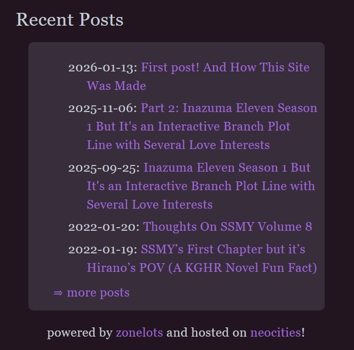
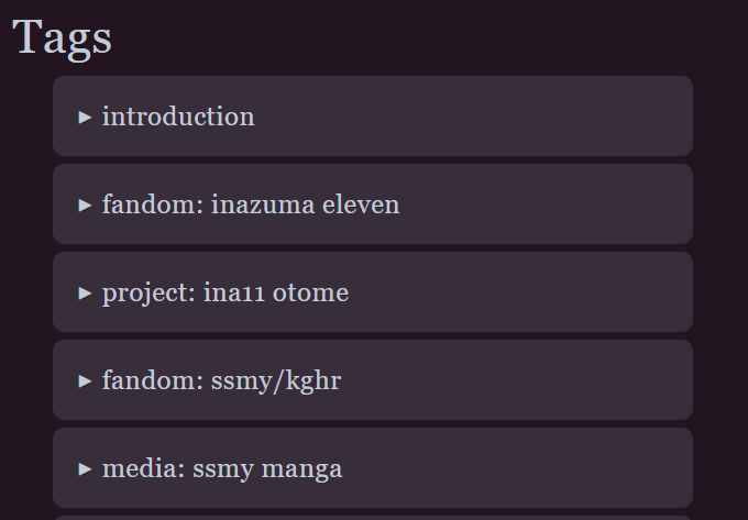
For the Recent Posts section, it was quite the struggle to remove the bullet points from the list. Not sure if I'm gonna add something or keep it like that yet. Apart from the bullet points, I also played with the padding. The link to the archive from the landing page was also an addition taken from nami's blog as well was the credits below that.
I guess this blog had three inspirations, zonelots, Reader Mode, nami's blog, and my own site.
I also learned that with JS, it works best if you remove code rather than comment it out for some reason.
At the end of each individual post, I added a blockquote for all the links the post has been syndicated to. It looks barebones but it does the job for now.
Oh, and I also added an hr tag after the tags and after the article tag of each post. With a bit of margin and padding so the breaks looked decent.
Dang, I keep looking at it and think, "this looks so minimal". It really doesn't seem like it took so long. I'm not tooting my own horn with this, I just don't know what else to write about the proceed because it looks simple (derogatory).
Anyways, this was just the first of my web dev shenanigans, onto the next!
Link Hub
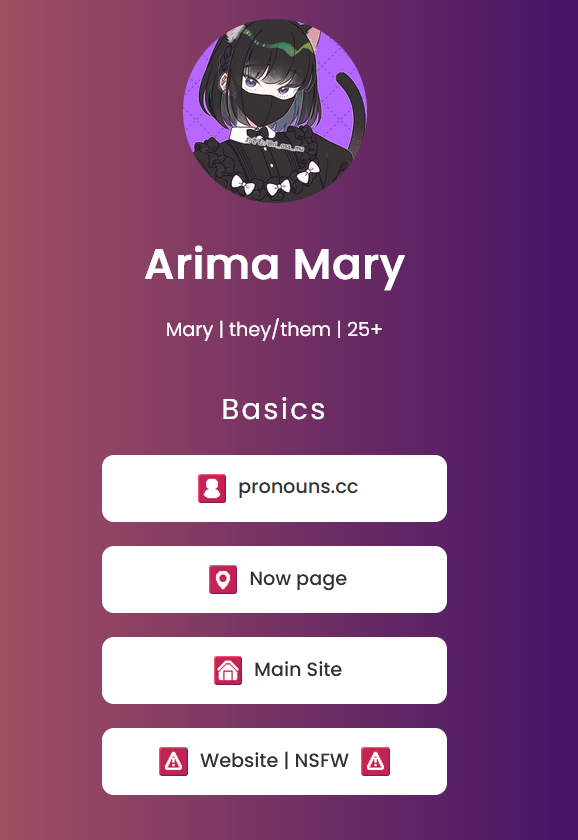
Updating my link hub was one of my yearly projects. I was a bit scared the code was gonna break real bad when adding sections but nope, it was pretty easy! Thankfully, the base code rests on HTML basics with the hardest part being flexbox.
So the changes I had to make were adding a bunch of accounts (pronouns.cc, now page, status.cafe, Tumblr, Pillowfort, legacy accounts, and Toyhou.se). I took great inspiration from Azure Mist's link hub with the different categories. First, I made a draft in my Obsidian vault for the categories. Before starting this update, I thought I had the draft done but nope, it looked off so I remade the draft as I was working on the new version. I ended up with four categories (Basics, Social Media, Writing, and Art). The Toyhou.se account sprung to me at the last moment. So yeah, the draft was out of date haha.
Here's a summary of the process:
- Duplicated buttons according to the number of links to add.
- Created sections for each of the four categories using the
sectiontag. - Copied the text and links for each new account.
- Moved each button to its respective section.
After this, it was time to go to the stylesheet. The main thing was to fix the code to reintroduce flex box. I think most of the new styling was added to the section tag, particularly for the space between sections. Think I also increased the font size of the section titles.
Last but not least, I replaced the emojis with icons! These are from AnubIcons. I had this set on my sights as I follow the artist on Mastodon and I really like how the icons looked. I wanted to add an icon for all the platforms I used but some like Dreamwidth, Pillowfort, Wattpad, and FFN.net weren't available. Also I hadn't thought about icons for non-platform sites so I took a look at AnubiSymbols that come with the pack and decided to use them as well. All in all, I used four Anubi icons (Fediverse, AO3, Tumblr, and Toyhou.se) and seven AnubiSymbols with the most used one being the file. I do want to change that at some point but I have no ideas at the moment.
Another fun thing about adding icons to each button was that I got to practice how to add and manipulate images. My main reference for this was the front-end of Bede's link hub. I practically copied the styling to be honest. I think the vertical-alignment property was particularly useful. Resizing them to 24×24 also makes them look nice.
Lastly, I added credits for the icons and symbols at the bottom. Had to change the color of the link because the contrast was terrible. Not the color use for them but it works for now.
So this was my second stylesheet shenanigans, onto the third!
Rentry
I think after updating my link hub I was in a roll to do something else. I went through each account in my brand new link hub in search of something to edit. First on the list was literally my Now page! It was the weekend so I did this out of fun. I had seen a couple of entries with styling so I tried my hand at it. I'll share the whole code under a dropdown because it more doable than the previous two projects.
						PAGE_TITLE = ArimaMary's /Now Page
						PAGE_DESCRIPTION = Dynamic Rentry page with my current priorities across the interwebs
						SHARE_TITLE = ArimaMary's /Now
						SHARE_DESCRIPTION = Dynamic Rentry page with my current priorities across the interwebs
						OPTION_DISABLE_SEARCH_ENGINE = True
						OPTION_USE_ORIGINAL_PUB_DATE = True
						SECRET_EMAIL_ADDRESS =! || 8800d51c543179f0ac0e9c8c1a4041cf || 19 Dec 2025 ||
						CONTAINER_PADDING = 25px
						CONTAINER_MAX_WIDTH = 600px
						CONTAINER_INNER_FOREGROUND_COLOR = transparent
						CONTAINER_INNER_BACKGROUND_COLOR = #22151f
						CONTAINER_OUTER_FOREGROUND_COLOR = transparent
						CONTAINER_OUTER_BACKGROUND_COLOR = #edd6fc
						CONTAINER_BORDER_COLOR = #815b7e
						CONTAINER_BORDER_WIDTH = 12px
						CONTAINER_BORDER_STYLE = solid
						CONTAINER_BORDER_RADIUS = 4px
						CONTENT_FONT = Poppins
						CONTENT_FONT_WEIGHT = 400
						CONTENT_TEXT_SIZE = 16px
						CONTENT_TEXT_COLOR = #c2cbd6
						CONTENT_LINK_COLOR = #9f67d3
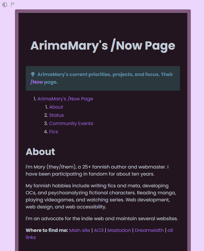
I started fiddling with the styling based on the example given (which is horrendous and has poor contrast). It was thanks to this little project that I realized copying the style from my other accounts and the color scheme was pretty convenient.
The example already had a container of a certain size so I decided to keep it. Then, I adjusted the colors with my dark color scheme and the background of my light color scheme as the most background color.
I could also add external fonts so I used Poppins, the same font used on my link hub!
The example style also came with a border around the container which is what gave me the idea of copying the style of another account, that being Dreamwidth. They look really similar now! Only difference is the background now that I notice but that's fine! Back in my Rentry page, I played around with the border and border-radius properties until finding something I liked. I removed a lot of properties I wasn't interested in.
The max width of the container is 600px with 25px padding. I set the inner and outer foreground colors of the container to transparent because it gave the effect I desired. Didn't try to remove them actually.
I could probably change the color of the admonition callout but that property wasn't in the example so I didn't change it.
This was actually really fun! Rentry isn't really a place I thought I would get to practice CSS but it was really approachable. I really recommend it!
status.cafe
Down the list was my status.cafe. Following what I learned, I found a template, slapped it on my workspace, and got tweaking. Again, I decided to go with my dark mode color scheme.
After a look at the code, I noticed that a lot of lines were repeated. I wasn't sure of the restrictions on user-input so I removed some lines that I didn't need and updated the color scheme first. Once again, I used nomnomnami's account as inspiration.
I removed the part of the code to limit the number of updates because it also removed the link to older ones and I didn't know how to fix that.
One big addition to the code is responsiveness. I worked hard to make this responsive for some reason. Probably just because of that border separating my bio from my updates. It wasn't working just with the 400px media so I added the 600px one as well so that the border changed from a right border to a bottom border. It was good practice though! I hadn't practiced this much before so I'm happy I did this.
Playing around with the padding and border of each section was also interesting. What I should have first taken notice is how the page is set up. Because I can't touch the HTML, I should have checked the classes ids available. One of the most important classes that I found was .col which indicates the grid of the bio and the updates. At first, I wanted the two to be separated (also from the header) but I liked how nami's looked to I joined them. .col is extremely important for responsiveness as well.
Inside, both the bio and updates are wrapped in a section tag where the bio is the first child and the updates the second child. I used the former property to get the border to work on different screen widths.
On my profile section, I also added a background to the "Home" and "About" titles and hid the whole email section. Just realized that I probably should also add a background to each update, now that I'm looking at nami's account again 🤔.
I didn't join the header to the two other sections because it looked kinda off but I couldn't fix the misalignment of the header on smaller screens so I might join them after all.
Other minor styles applied were applying the border-radius property to curve the corners of the containers, playing with the padding, font, and font size. I was able to add Poppins here as well which made me very happy! I was also able to apply the same property above to style my pfp into a circle. Fun!
I might keep editing this account a bit more by looking at the HTML (I didn't really) and see how I can center my username and pfp. Maybe add some line spacing to that plus and the "Statuses." text.
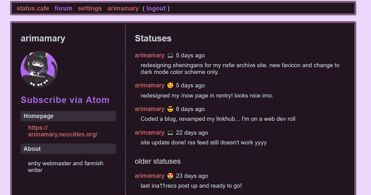
You know, I thought this was going to be much more complicated. A have a little thread on my Mastodon with the resources to get editing which I found a bit intimidating. But when I get into it, it was just styling! A bit more complicated than Rentry's yes because it's got actual HTML to refer to but the amount of elements to keep an eye out for were rather few so I didn't get overwhelmed. And the result is beautiful! (o^▽^o)
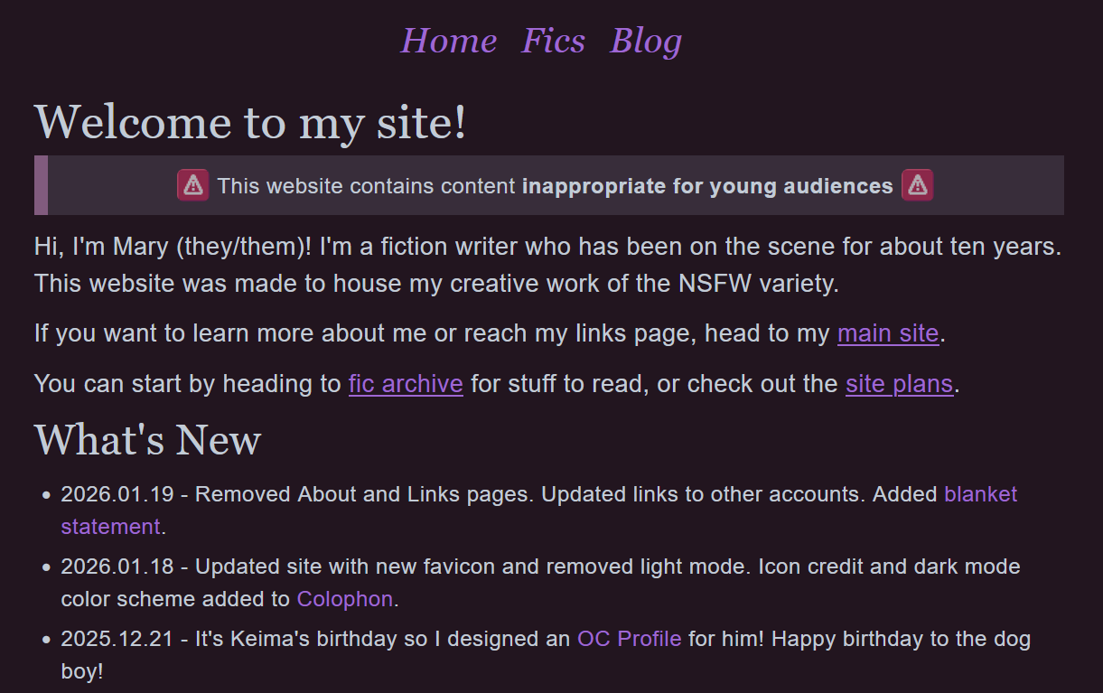
NSFW Site
This one was a quick update. I've had in mind for a bit to just keep the dark mode color scheme to match the site's theme and to make it a bit easier for visitors to understand the kind of site they were visiting because it looks exactly the same as my main site. So that's what I did! Also updated my favicon on all pages. Oh, and added the code for the color scheme on the Colophon page. I'm really proud of it and use it in all my accounts because it's more convenient for me to have it somewhere easily accessible.
Main Site
Oh my main site. It has been giving me a lot grief since I wanted to test the deploy to neocities tutorial I found here. The thing broke most of my links so the prospect of fixing them all was overwhelming to say the list. Alas, this week, I got to it. Followed all the steps, fixed the broken links, and voilá, the damn thing didn't work. The only thing that deployed was my landing page. That was a whole day of work that I wasn't getting back so I left it alone for about twenty four hours.
I decided to just forego the whole thing and update my site as usual, uploading individual files to Neocities. I began to update my site with the new favicon, links page, cleaned up some files I didn't need, and added a link to my blog. Of course, I updated the Credits page and About page.
Doesn't seen like my main site got much styling woes now that I think about it 🤔. More like back end stuff gone wrong.
Update: So I did got to add some styling to my site. Visible mainly on my homepage, links page, and about page. Well, the last one was rather minor. I just made my pfp into a circle and centered the ID buttons (I really like it as a circle what can I say).
Welp, that was a week of tweaking with styling. I'm surprised at myself for the amount of stuff I worked with an how smoothly it all went. Granted, these were all from templates but I did feel like I was applying what I learned during my HTML/CSS lessons, particularly about responsiveness.
I think of one the things that are used the most in web development is pattern identification. Because most of what I did was changing values and adding whole expressions to see how the browser displayed it until I was satisfied with it.
The biggest thing I got out of this whole journey was that keeping a color scheme in mind for all my online presence takes out a lot of guess work out. I don't need to think about which color goes where because my color scheme already tells me that.